Not only are we committed to protecting the safety and integrity of our trusted rental community, we are also always looking for ways to improve our platform by enhancing usability, performance and features. We’ve been listening to our users and have responded with some key changes to our photo management functionality that make it easier for landlords to present their properties in the most attractive way.
Organize Photos Easily
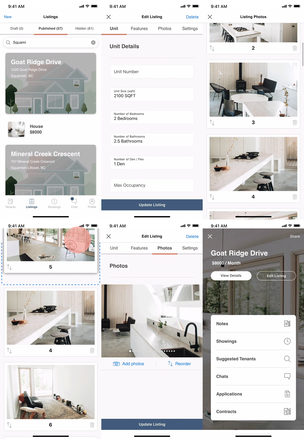
How to Change Order of Photos
It is now even easier to organize the photos of your property. You can now upload (add), delete (remove) images and modify the order in which they appear in the image carousel for your property by simply dragging and dropping the images.
How to Set a Cover Photo
To select a feature image (cover photo), drag the preferred photo to the very top. This image will now represent your property when users are scrolling through listing. The rest of the property images will display in the carousel once the user selects your property.
First Impressions Matter
When trying to attract the best possible tenants, first impressions matter. Taking good property photos that are well composed, well-lit, and in focus is the very best advertising you can get for your place. Photos of a tidy space will attract more tenants than a blurry image of a messy kitchen so take the time to research how to take good property photos. In the liv.rent app, it is also important to choose the very best image you can to be your ‘cover’ photo. Trust us – it will significantly boost interest in our property.
Choosing a Cover Image
We’ve told you how to set your cover image, but how do you choose a photo to be your cover image?
Our data suggests cover photos that feature these 3 elements, draw the most attention from users and the best selection of applicants:
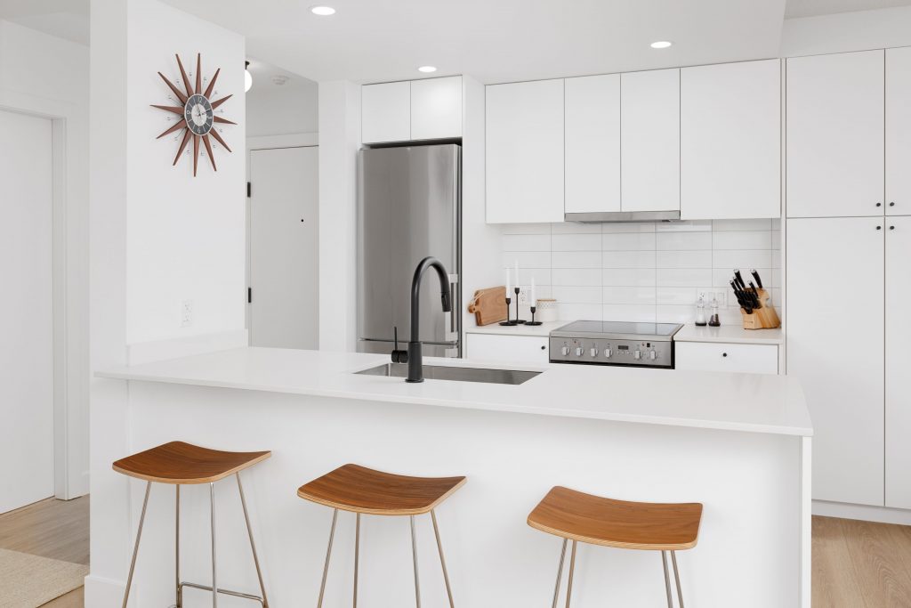
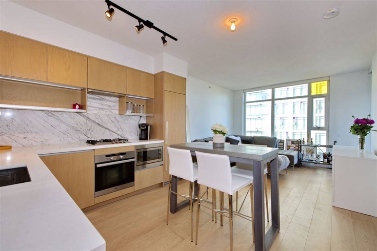
1.Kitchens
Let’s face it, people want a clean, functional, and ideally modern kitchen. If your property features this, then photograph it well (see our post: 10 Tips to Photograph a Rental Property – Phone Camera Tips ) and consider using a kitchen image as your cover photo.
Below is a good example of kitchen images for use as cover photos from our listings:
2. Views & Outdoor Spaces
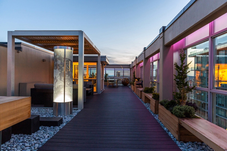
Given many urban properties are compact, the ability to broaden your horizons beyond your four walls is attractive. If a property offers expansive views and/or great outdoor spaces, feature them. People love images of city scapes, oceans, mountains etc.
Below are good examples of cover photos from our listings:


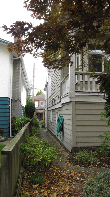
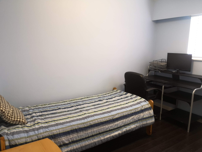
Contrast these with the poor examples below. In the exterior shot, nothing meaningful is featured. You see a corner of a house. While the bedroom photo is poorly lit and the desk and bed both cropped conveying a spartan, cramped room. Neither of these will entice users to investigate further.
3. Pools & Amenities
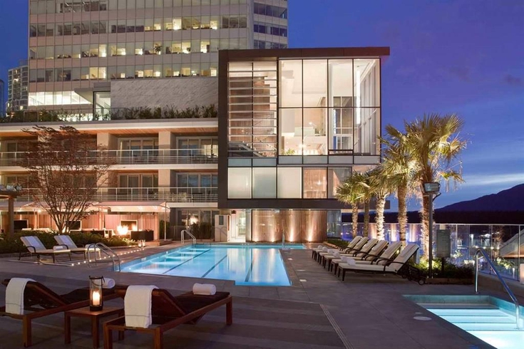
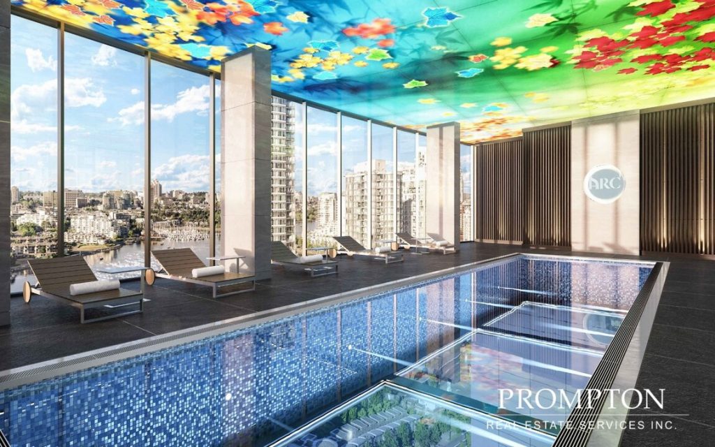
Pools immediately evoke a sense of luxury and escape. If your property features a pool or other luxe amenity – like a well equipped gym, consider using one of these images as your cover photo.
Choosing the Rest
Once you’ve decided on a cover photo, carefully consider the other photos you include. Do they show your property at its best? If not, take some more. And consider these property photography tips:
- Before snapping that pic, de-clutter as best you can. Remove personal effects, dish towels, discarded coats etc.
- Dark spaces are unattractive so if possible, take photos in daylight and turn all the lights on in your place.
- Ideally, include an image of every room and outdoor space. This helps prospective tenants get a real sense of the space.
For more detailed advice, see our post:
10 Tips to Photograph a Rental Property – Phone Camera Tips. And remember, you don’t need a fancy camera. Your phone is sufficient. Just brief yourself on the fundamentals of composition. That is the key to a good photo.


0 Comments